On the left is the US cover, which I'm sure most of you are familiar with. I like this cover, with its varying blue tones and especially the softness of the title and author name. Looking at this book cover makes you feel a bit like you're melting into it and it goes along so nicely with the gorgeous prose.
The amazing gem in the middle is the German version. It's different from the other foreign variations, but you must admit that it is so beautiful. The simple silhouettes of the girl and the wolf tell so much, and I adore the curling branches and dreamy pinkness.
By contrast, the UK cover all the way on the right is considerably darker. It's very similar to the US one, but features stark black and white contrast, with a bleeding heart and ominous title. I like this cover as a piece of art, but I feel like it's too dark for the story itself.
Here on the left we have the French cover. The font they chose for the text is very beautiful and matches the story well, but I'm not really liking how the pink goes with the black-and-white photography. I also feel like this would be a better cover for a contemporary novel.
The Italian cover is in the center, and you can tell right away that it's different from all the other winter-themed ones. I actually quite like it, with that silver heart, red moon, and bright red claw marks. It's simple but elegant.
Next up is the Chinese cover, which is definitely one of my favorites. The image is a beautiful, simple, and haunting scene that describes the story as elegantly as the text within. I'm also a big fan of the white space beneath, and the way the Chinese characters frame it.
 |
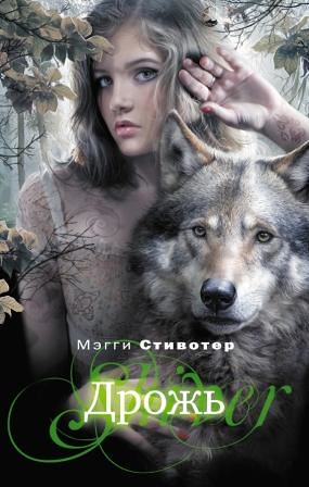
They start to get a bit funky here. On the left, we have the Russian cover, which is very cool and very different, although not my favorite. It feels like a straight-out fantasy, complete with the glowing, swirly green text at the bottom, and the model they chose.
The Bulgarian cover is rather creepy. I love how they wrote the title, but the rest of the cover feels like it belongs on a thriller. The wolf's eyes are scary, and the sad-looking girl crouching in the middle of the road doesn't really help matters.
Finally, we have the Brazilian cover. It's very elegant and easy on the eyes, but it doesn't really scream "romance" to me. I adore simple text, though, and this title definitely has that.
So, that ends my analysis of Shiver's covers! The rest seem to be variations of the US or UK cover. What do you guys think? Which are your favorites and least favorites?


2 comments:
I love the Chinese, Brazilian and German.
I have the UK one and actually really like it. but have to admit it's a bit darker than the story.
Never knew there were so many. thanks for showing us all those wonderful covers :D
I do love the UK one! Somehow the blackness just adds so much to the book.
Post a Comment