Rss Feed
Showing posts with label kim harrington. Show all posts

Expectations vs. Reality: The Dead and Buried

Expectations vs. Reality is a feature here inspired by Small Review that will compare my expectations from a book cover before seeing the summary with the summary itself.

This week I'm looking at The Dead and Buried by Kim Harrington.


EXPECTATIONS

This cover is fantastically creepy! The girl seems to be descending into a cellar or basement of some sort, and the combination of the ghostly feel with the title makes me suspect there are ghosts and spirits haunting her house. Perhaps it's the kind of story where the protagonist needs to resolve the ghosts' problems and free them to the afterlife.

REALITY


Here's what Goodreads has to say:
A haunted house, a buried mystery, and a very angry ghost make this one unforgettable thriller.
Jade loves the house she's just moved into with her family. She doesn't even mind being the new girl at the high school: It's a fresh start, and there's that one guy with the dreamy blue eyes. . . .
But then things begin happening. Strange, otherworldly things.
Jade's little brother claims to see a glimmering girl in his room. Jade's jewelry gets moved around, as if by an invisible hand. Kids at school whisper behind her back like they know something she doesn't.
Soon, Jade must face an impossible fact: that her perfect house . . . is haunted.
Haunted by a ghost who's seeking not just vengeance, but the truth. The ghost of a girl who ruled Jade's school -- until her untimely death last year. It's up to Jade to put the pieces together before her own life is at stake. As Jade investigates the mystery, she discovers that her new friends in town have more than a few deep, dark secrets.
But is one of them a murderer?
Okay, so I was pretty close with the ghostly part, although it wouldn't take a genius to figure that out! The idea of one of the people in her town being a murderer is intriguing though. I'm looking forward to picking this one up!

Original vs. Sequel

Recently, quite a few sequels have had their covers revealed in the blogosphere - some great and some, well, not so much. This post highlights four original books and their sequels.

First up is Wither and Fever by Lauren DeStefano.


I'm a big fan of Wither's cover. The model is beautiful, and her dress gives such a soft, airy feel to the cover that's perfectly complemented by the darker background and elegant title placement. Subtle details are pointed out by the circles and lines, like the interesting birdcage and her left hand. This is one of my favorite covers of 2011.

But then Fever? Not so much my favorite. The slinky gold dress is cool, but the model looks emo and the colors in general are garish. The green of the title, as well as the circles and lines, clashes with the gold/pink theme, and the extra elements (like the rocking hourse) aren't as intriguing as in the first cover.

Overall: Wither wins, by a long shot. The only positive thing I'd say is that having read the first book, I really want to pick up the second to find out what the heck happened to the protagonist given the dress and her surroundings.

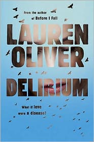
Next is Delirium and Pandemonium by Lauren Oliver.


Although I generally like simple covers, Delirium is a little too simple for me. It's a neat idea to have the face behind the words and the flying birds are great symbolism, but this just isn't something that would really capture my attention.

Pandemonium is a pretty big improvement. What appear to be plants surrounding the model's face are intriguing, and I'm loving the warm, fiery tones, as well as the glowing title. (Plus, I'm a sucker for lower-case titles. I don't know why.) The only complaint I'd make is that it's a half-face model, which isn't really my taste.

Overall: Pandemonium wins, despite the half-face. Delirium's cover has an interesting concept, but it's just not for me.

Now we have Clarity and Perception by Kim Harrington.

Clarity was another one of my favorite covers of 2011. I just adore the simple background and light green-blue hues, and what they did to the model (especially her hair) was very neat. It's pleasing to look at, and the girl's expression does a lot to draw you in.


Unfortunately, I don't perceive Perception (sorry, I couldn't resist) to be the same. It resembles one of those old paperback thrillers, with the girl's face and the title. The rainbow colors in the background are cool though, as is the repeated (but darker) imagery of birds from the first book.

Overall: Clarity, all the way. It's sleek and modern, and Perception... is not.

Finally, we have Across the Universe and A Million Suns by Beth Revis.


Across the Universe's cover is unapologetically science-fiction, and I'm digging the awesome purple, red, and pink nebulae-things at the bottom. The top half isn't quite my favorite, because I always see a sideways hourglass instead of two people kissing, and their forms look kind of alien-like anyway.

Following the sci-fi theme of the first book, A Million Suns is just as cool, except with mainly blues and greens. I'm not a fan of that random big glare on the left, but I much prefer the people here to the ones on the previous cover. They look normal, and the hand-holding is sweet.

Overall: It's pretty close, but A Million Suns wins for not having alien-like sideways hourglasses.

What do you think of these covers? What are your favorites of each pairing?