| 
|

|
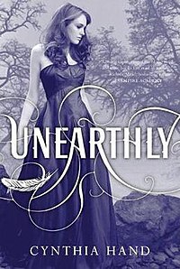
First up is the traditional American cover that most people are familiar with. I like this cover, especially in person (shiny!), and as much as everyone complains about it, I don't mind the girl-in-pretty-dress trend. My favorite aspect is the typography with the title; I'm a sucker for curling text, and the little floating feather is perfect.
Next is the Australian version. This cover is pretty, with the pink/orange/red tones next to the darkness and faint curling lines, and I love the model's dress, but nothing about this really draws me in to the book. It looks like a typical paranormal romance novel without anything to distinguish it.
Finally, we have the UK version. I adore every aspect of this cover, from the deliciously creepy ghost girl to the silver/blue tones. I don't think the cover fits the story too well, but this book would draw me in like that.
So, my favorite cover is the UK one, followed by the American, and in last place is the Australian cover. What's your favorite/least favorite?


0 comments:
Post a Comment